How to Design Mobile-First Surveys in 2026

Over 60% of survey responses now originate on a mobile device, and that number keeps climbing. A survey designed on a desktop monitor and never tested on a phone is designed for a shrinking minority of your audience.
Design for Thumbs, Not Cursors
Tap targets need to be at least 44x44 pixels — the accepted minimum for reliable thumb interaction. Radio buttons and checkboxes designed at desktop scale are frustrating and error-prone on a 6-inch screen. Favor large, full-width answer options over compact grids.
Eliminate Horizontal Scrolling
Matrix questions (grids of rows and columns) are a common desktop pattern that breaks entirely on mobile. If you need to ask about multiple items on the same scale, stack them vertically as individual questions rather than forcing a wide table into a narrow viewport.
Minimize Typing
Typing on a phone keyboard is slow and error-prone compared to a physical keyboard. Wherever possible, replace open-text fields with scales, single-select, or multi-select options. Reserve free text for the one or two questions where qualitative detail genuinely matters.
Show Progress, Not Just Questions
A visible progress bar reduces abandonment significantly on mobile, where the survey often feels longer without visual context for how much remains. Pair this with short, single-focus screens — one question per screen outperforms long scrolling forms on mobile.
Loading Performance on Mobile Networks
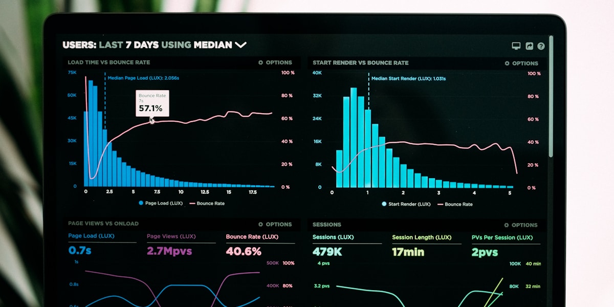
Mobile connections are inherently less reliable than desktop broadband, and a survey that takes several seconds to load on a throttled connection loses respondents before they ever see a question. Keep the initial payload small, defer loading anything beyond the first screen's content, and test explicitly on a throttled 3G or weak 4G connection using browser dev tools rather than assuming your office WiFi represents your actual respondent base.
Accessibility Considerations
Mobile accessibility overlaps with but isn't identical to desktop accessibility. Ensure tap targets meet minimum size guidelines for users with motor impairments, support dynamic text sizing so users who've increased their phone's default font size don't see broken layouts, and verify color contrast holds up in bright outdoor lighting conditions where mobile surveys are frequently completed. A survey that's accessible on mobile is, in practice, accessible to a meaningfully wider range of respondents than one designed only with desktop assumptions in mind.
Test every survey on an actual phone, not just a resized browser window, before sending it. Rendering quirks, keyboard overlap, and touch-target issues are often invisible in a desktop simulator.